Chope Mobile Redesign
Chope App is a service that helps millions of diners get instant confirmation for reservations to their favourite restaurants. In 2019, a redesign was embarked


I’ve been working on the Chope Mobile App since joining the B2C team in 2018. Although many design changes were made, one of the biggest project that was embarked was the redesign of the APP.
Why Redesign?

Updated look to new branding
As the company embarked on a new chapter of branding, vision and mission, I've decided that the app has to update its visuals to bring out the essence of the new brand. Many components are not consistent with their colours, shapes and fonts. Thus, with branding guidelines, the product design team and I set out to create our first design system.

A new design system that improves team collaboration & efficiency
As the app grew with more collaborators, many components started to get misalign. The product design team decided to invest time & effort into creating a design system that could maintain the design language and component across the various services and products.
The end results are, a large amount of time saved when building production specification for handoff sessions, less design misalignment in production specification, and the product suite of Chope finally looks like a family

Focusing more on visuals
From past findings, users are more incline to interact on images and icons. Also, as the service supports the food & beverage Industry, there is great emphasis on visuals like food & restaurant photography.
What was done is to create better spacing rules like implementing the 8pt/dp grid system and and left & right margin rule of 16pt/dp. And I’ve increased the padding between components

Font Standardisation
To make the reading experience tighter, we standardise new sets of fonts to use depending on the medium. For mobile native app, we’ve decided to use system fonts, SF Pro for iOS & Roboto for Android. This decision was made because it mades the app feels part of the eco system of the platform. Also, with only using the mentioned font family set for the specific platform, it creates a tighter, cleaner reading experience.

Iconography
In order to create the visual balance between the background, content and the icon, we have decided to replace the old solid icons with outlined ones. We do maintain some of the glyphs but they are mainly meant for activation state purpose.
The icons are mainly used in 2 sizes, 24pt/dp & 16pt/dp. They can be interacted alone or be placed on components like cards & buttons.

Buttons
As buttons are one of the most important transactional component, we have created a set of buttons all with standardise roundness, font size and placement and the states. This allow us to apply them across most of our products and marketing materials without the need of building new ones,
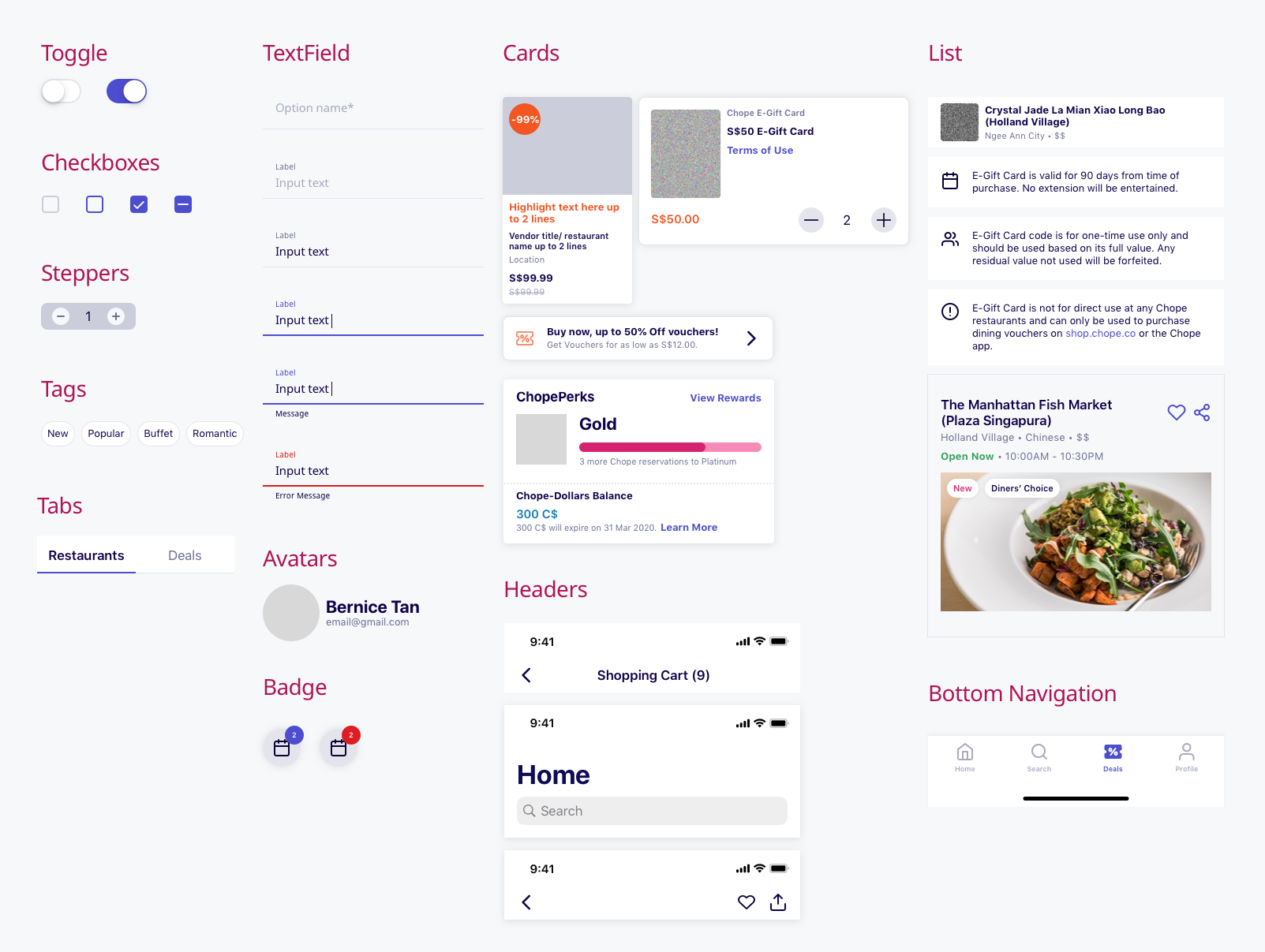
Components Library
A major part of the design system is the component library where the elements serves as the building blocks of the mobile app. These component serves to build up recognisable patterns of interaction whenever user interact with them,.
Putting them together

Samples of working art boards (not all are shown)
Some Problems Solved for Chope Mobile

Improvement to user flow and navigation
Task Success rate has gone up since the redesign has been implemented. No longer are ambiguous call to action button or components that doesn’t provide basic clarity and understanding to the users.

Faster development, improvement on feature function & stability
As the component align, many features are able to developed fast and with greater stability. Less design production mistakes were made. Even the time I take to design reduce significantly.
An example is the search feature where the app use to be multiple search tool & whenever we proposed to unify the search experience, we were unable to align due to conflicting component functions. Today, the search has vastly improve and due to the redesign that allow us to upgrade the feature, we see huge increase(30%) in adoption rate of deals search.