
Redefining the Search Experience on Chope Mobile
From MVP to Unified product for the various business unit
Case Study 2018/2019

“How might we allow the users to easily search for any keywords and get relevant results?”
Background
In year 2017, a new major Business Unit was created. The Chope Deals team was conceived to provide our customers with great discounts from our Partners & Vendor.
However, due to the rapid expansion of the new business stream’s requirement, it has it own search flow that is not aligned with the rest of the app.

Customer Journey to identify various barriers & opportunities across the app

The app in 2017 prior to the search improvement project.
User Pain points:
When users are searching for a keyword, there is no proper feedback to aid the user while he is doing the input. The search was a directory filter and if there are spelling errors, there is no hint or recommendation to guide him.
There are different type of searches parked at different section of the App. This creates confusion as they might try to search a deals product in a restaurant search and it returns no or unfavorable results.
Users went through 2 flows of searches to get to their desired result.

The Goals:
Improve our current searches from a directory search to include elements of discoverability and recommendation
Create a holistic search where user easily recognised the entry pattern and improves on the engagement rate of other searches(deals).
“In early 2018, when I first transferred to the B2C team, there wasn’t much available data from the also newly formed data team to track user behaviour properly. We had to make use of qualitative research & data mostly to justify our actions.”
Research
Desk Research
We observed mainly how are searches being done by some prominent players in the region. Basically we chose to study these few examples due to them having the element of discoverability & intuitiveness in their search feature.

Redmart (2018)
Redmart was a Grocery Delivery App and their search excel in providing auto suggestion and also giving the user direct click through to suggested products.

Google Maps (2018)
As the biggest search engine company in the world, I’ve looked into their established patterns of searches. In the map app, they presented their auto-suggestion in categories which allows the users to have some expectation to what will happen if they click through

TripAdvisor (2018)
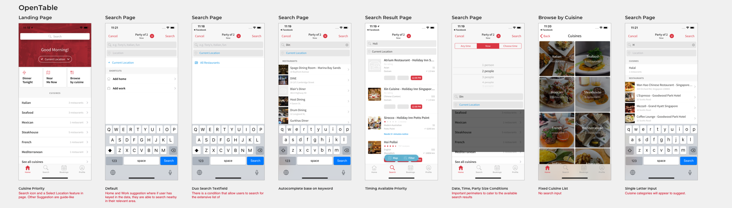
OpenTable (2018)

User Interview
A usability test was also conducted with some of our users who have used our services(web or app) but doesn’t use them often(2-3 times a year). We test the candidates with a simple task of searching for their favourite restaurant & we also asked a few search behavioural questions. Some of the interesting statements that surfaced in the findings.
“I was trying to search for my favourite restaurant “Burnt Ends” and no result came out. I just realised they are not on Chope”
“When I used the search, I normally decide tapping through on the restaurant because of the nice photos”
“I usually use google to search and explore for food. I only use the Chope search because I know I want to book at this restaurant.”
“I know my favourite list of restaurant and which of them are on Chope, so the search was relatively easy to use.”
Goal 1: An intuitive search that can search for things
With limited resources and a lean team construct, the team put our heads together with a strategy that aligned with our viability, desirability & feasibility concerns. While we understand that conversions are caused by many factors, one of the main metrics we wanted to reduce was the drop-off rate due to the unintuitive search.
The drop-off rate sits at 26% prior to the design changes(Calculated from click-through & final conversion numbers)

Wireframes
Goals:
Allow users to search for any keywords and get a return on results
Allow users to while during their search input gets an auto-suggestion list

The base wireframes of the new flow. I tested this in a rapid prototype and found out that:
Most candidate will engage with the restaurant listings in the input phase
Very few people will try to pick Party Size, Date & Time(PDT) when they use the search
While the old PDT is on the home page, most people didn’t realise it was gone and they interact with the new PDT on search result page without much friction.
With ChopeDeals as part of the app already, people want to see deals information on the search result page
With these insights, I’ve decided to make a few changes and proceed to production specification for this feature. This is because we(mostly data team + me) desired a much higher quantity of behaviour data to know how our users interact with the search.
Pushing out to users an MVP but also with other concerns of Desirability & Feasibility


We completed this feature within a tech sprint(2 weeks) and did an A/B Test on this rollout. Some main feedbacks were:
Cleaner design and they know which restaurants provides discount
The PDT requires more taps than expected as some felt it was takes too long to complete the task. *Most of the PDT component were still legacy at that point
The discount on the timings in search result page could be misleading
Auto-suggestion list was well receieved but the interactions when trying to tap on the restaurant was a bit clunky(due to loading)
With this round of feedback and there were not critical feedback or immediate to act upon, we launched this to all our users. This time round, we(data team) included more tracking points to capture user behaviour.
Data Results from new MVP
Tracking search behaviour via MixPanel
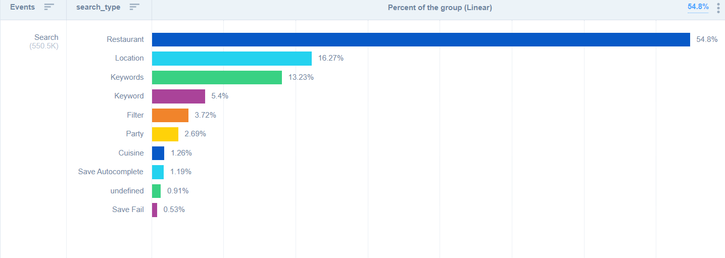
As the new search has trackers embedded in the flow, we finally could look at some of the behavior & usage patterns of our users. Most of our users search for restaurants and locations. We make the assumption that users who use our search tool has high intent of finding a specific restaurant/vendor information more than for discovery purpose.
Other Insights provided by our analysis
Top 3 filter are Location, Cuisine & Promotions
The PDT selector is used less now but the conversion rate did not drop. The assumption is that people want to search for what they have thought of more than finding random availability
The PDT selector is mostly used with either another filter or search term.
Improving on the MVP
Enhancing the features inline with changes in navigation of the app

Navigation was a focus enhancement of the 2018 App, the feature of finding a reservation was moved into its own tab. On this tab, users are able to perform search based on their various filter preference like PDT etc.
Also, the PDT has been updated based on the feedback so that users will engage in lesser clicks and introducing quick suggestion
Goal 2: Unifying all the different type of searches into a single holistic feature (Global Search)

Pushing for single point of entry for search

MixPanel Flow chart of top search query that converts. Table created by Raymond Chan(DS).
The flow tell us that around 55% of our users will tap on a restaurant suggestion and the remaining will go on to a search result. This shows that the auto-suggestion feature that was introduced in 2018 was a success as it brought users to their destination quicker
The drop-off rate has been reduce from 26% to to 12.7%
Global Search - Moving Deals Search into the same search entry point
I’ve mentioned earlier that the search for deals product has always been a separate flow. This was a hurdle that we need to overcome so that we are able to continue towards our vision of a unified search

Surfacing Non-reservable search into the results page
In 2019, Chope introduced a new series of deal products which are kiosk vouchers. They are vouchers customer can purchase on the go, and they do not need reservation. As the service has predominantly cater to reservation and search has been crafted around it, we were unable to “just surface it”. Below is the take on the problem:

First Perception User Test
UX research planning by Denise Ding(UX Researcher)

A/B Testing on usability hub
We did a quick Hi-def mockup for this perception test, to find out if what we proposed will make sense or not

Findings
Proposed design works better
UXUI Updates base on research


As around 45% of our users who engage in search will end up on a search result page, we have updated the component so that certain information are better presented to the diners - Deals information, Like & share button etc.
Learnings & Insights
30% increment in search for deals product.
Customers will tend to perform their search for restaurant via google. We need to find a way to complement this behaviour.
Most of our returning users used out search to locate their favourite restaurant. How can we make this simpler for the users?
While having a tab controller in search result is great, it seemed that if a search result could seamlessly incorporate the various informations under a single page will even be better.
Users are still confused on the difference between Reservable and Non-reservable results. We need to indicate the information better to them.